Prakriya Hospital Website Redesign: A UX/UI Case Study
Streamlining visa application processes for travelers, students, and professionals.
Client
Prakriya Hospitals
My role
UX Researcher
UI Designer
Webflow Developer
Date
Oct’23 - Nov'23
Introduction
Prakriya Hospital, a leading healthcare provider in Bangalore, India, approached our UX/UI design team seeking a complete website redesign. Their existing website suffered from outdated visuals, lack of responsiveness, and technical issues hindering user experience and lead generation.
Business Problems
The website presented three distinct problems:
1. Lacked Visual Design and Poor User Experience (UX):
- Lacked modern aesthetics and user-friendly interface.
- Unresponsive design, resulting in poor experience on various devices.
- Unclear navigation and information hierarchy, hindering user engagement.

Home section

Our doctors landing page

Our doctor cards

Blog layout

Testimonial layout

Old - Our Facilities layout

Old footer layout

Home hero section
2. Inefficient Forms:
- Book an appointment’ form presents a challenge for users due to excessive data entry, leading to extended completion times and potential data inaccuracies that were causing delay in the internal service team to assign the doctors to the patient enquiries.

Book your appointment form
3. Limited SEO Optimization, Broken Links and Unreliable Functionality:
- Unoptimized page titles, meta descriptions, and content for search engines.
- Slow loading times further hindering search ranking potential.
- Lack of accessibility compliance, excluding users with disabilities.

Compliance check report
Proposed Solutions - A Better Form Experience
I addressed each challenge through a comprehensive design and development process:


Visual Design
While we understand from the earlier designs that the site not just needed a visual upgrade, but also needed a UX alterations, while still aligning with their brand colors. A small brief on design rationale:
- Colors
Primary (#702362, Deep Purple) stands for trust, professionalism, and modernity, aligning well with healthcare domain. - Typography
Headings (Source Serif Pro) for readability and elegance.
Body text (Manrope]) for clean lines and screen readability.
.webp)
Website styleguide
Final results
All the annotated screens are the design rational for the main sections within the site.

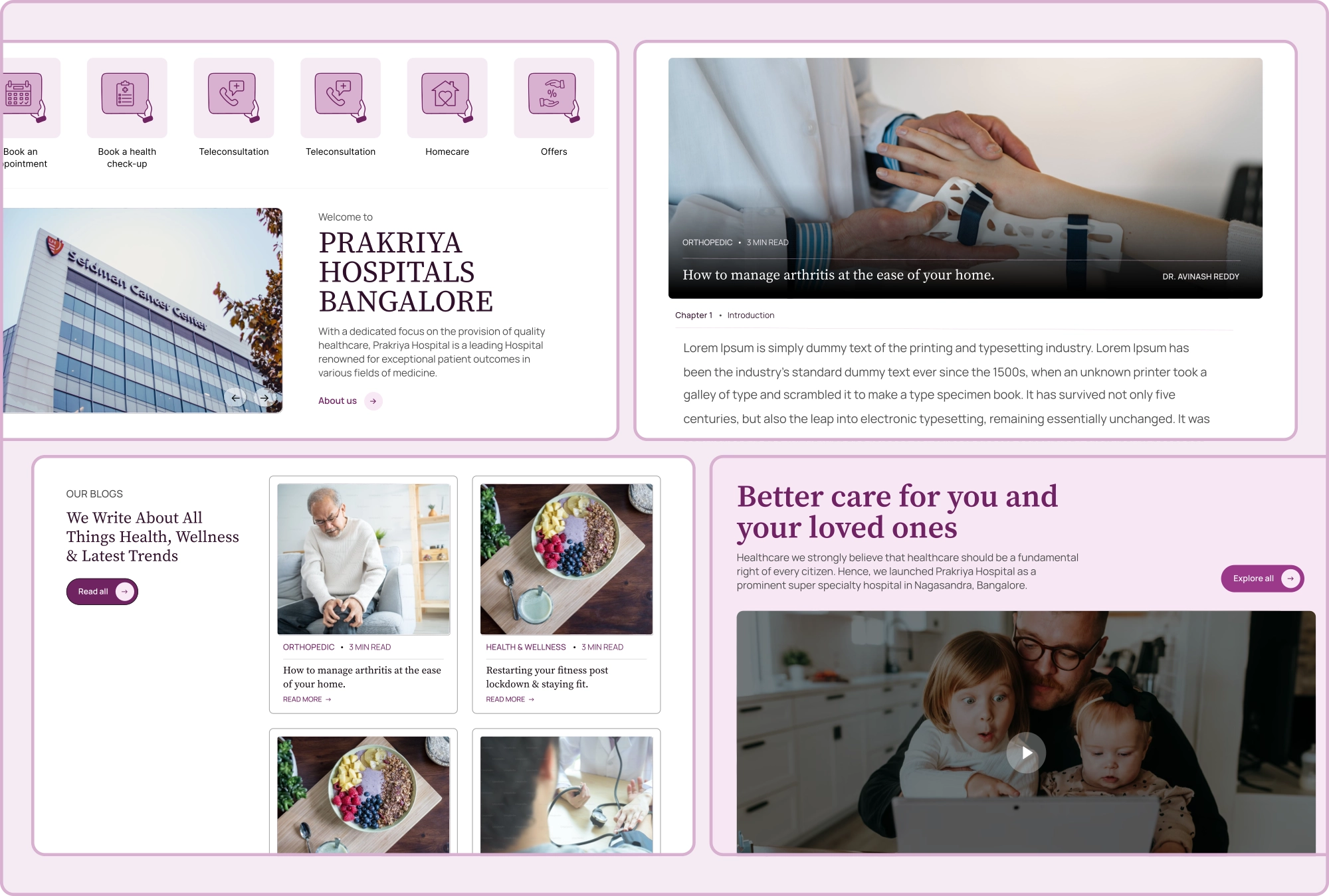
Homepage hero section with quick action buttons

Home and landing page department cards

Blog cards

Book an appointment form & feedback

New footer layout
Final Designs


Conclusion


Anticipating Needs:
I didn't just react to user pain points; I proactively anticipated them. By analyzing user behavior data and collaborating with hospital staff, I identified the scheduling conflict before user testing could reveal it.
Frictionless First Impressions:
Traditional design focuses on aesthetics, but I prioritized emotional resonance. Imagine a patient seeking care – their first impression shouldn't be a frustrating form. I streamlined the booking process, building trust and reducing anxiety.
Designing for Equity:
Accessibility isn't an afterthought; it's the foundation. I ensured the website is inclusive for users with disabilities, reflecting Prakriya Hospital's commitment to serving the entire community.


Read more

viisa.ai
Web design & Webflow development

viisa dashboards (admin + user)
UI/UX Design