viisa.ai - easing the visa application journey for Indians
Streamlining visa application processes for travelers, students, and professionals.
Client
Harsh Agarwal,
CEO, viisa.ai
My role
UX Researcher
UI Designer
Webflow Developer
Date
Dec’23 - ongoing
Live site
Figma file
Introduction
This case study explores the design of a user-friendly dashboard for Viisa, a visa application company. The solution caters to both applicants and administrators, creating a seamless experience for all users on desktop devices.
- For applicants, the dashboard acts as a central hub, guiding them through the entire visa application process. It provides a holistic view of their application status, documents, and progress.
- For admins, the dashboard offers a comprehensive overview of all applications. They can gain valuable business insights and manage the application flow efficiently from a single portal.
Problem statement
During initial calls with the company owner, we discovered inherent challenges for both user groups. To effectively address these pain points, we conducted a collaborative effort to identify core issues.
This problem statement provided a north star for the design direction, ensuring that the user's needs remained at the forefront of the design process.

User Persona
To design a user-friendly dashboard, we needed to understand the people who would be using it. These personas captured their goals, needs, and frustrations within the visa application process. By stepping into the shoes of these users, we were able to identify key opportunities to improve the application journey.

User Persona - Admin

User Persona - User
Visual assets
As the color Blue signifies calm, trust and security, it very well aligned with what we needed to achieve on our app. The color #013399 has a WCAG contrast ratio of 10.85:1 ensuring the app is accessible to a wide range of audience.

User Persona - Admin

User Persona - User

User Persona - User
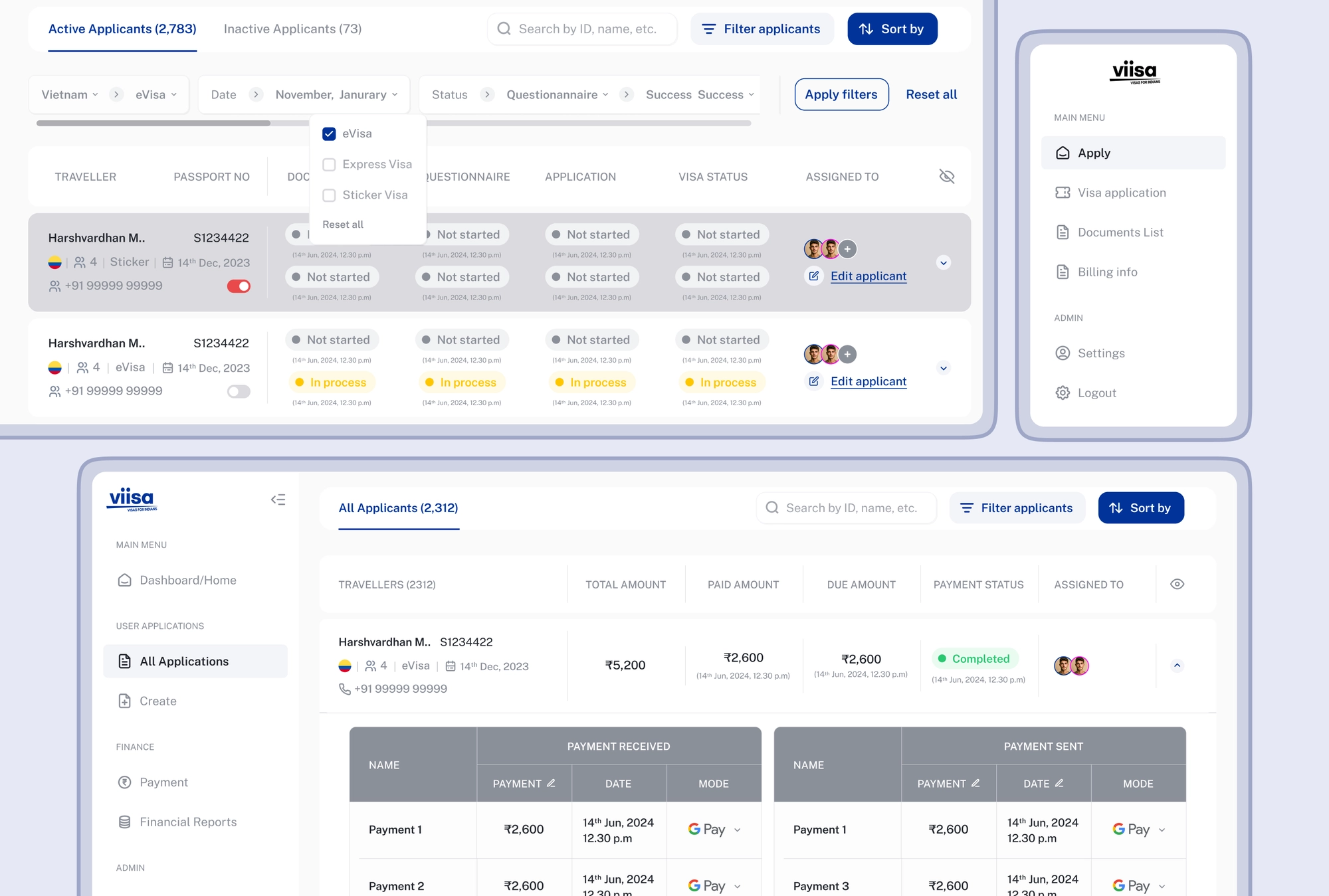
App division - UI Designs
Information architecture and user flow
For admins and accountants, crystal-clear information at a quick glance had to be right at their fingertips. By meticulously organizing content and defining user flows, I aimed to simplify the user flow clubbed with information architecture.

UI Designs
Designed a clear UI for viisa admins and accountants, prioritizing efficiency and easy access to application information.


Information architecture and user flow
A confusing information structure and unclear workflows were major pain points. To tackle this, I developed a user-centered information architecture and mapped out streamlined user flows with no dead-ends, ensuring a smooth and efficient experience for all Viisa users.

UI Designs
Designed a clear UI for viisa users, prioritizing journey from easy to understandable and shorter activity nuggets.


Conclusion


Illustrated and animated by Laxmi
Summarizing the efforts put in designing the dashboards and the impact of design decisions made, there were three key learnings -
- Focus on Clarity, Not Quantity
I embraced the "Less is More" philosophy by prioritizing essential information and avoided overwhelming the user by providing visual cues and avoided technical jargons. - Thinking about a new user
Since the business is in its novel stage, it was very important that I keep in mind that a lot of dashboard’s users would be new, and hence I kept things simple and intuitive. - Data grouping and Visualization
Since is site is information heavy and includes multi step context, grouping and segregating related information in concise nuggets made sure the process was intuitive and clear.

Read more

Prakriya Hospitals Webapp Redesign
UX, Web design & Webflow development

viisa.ai
Web design & Webflow development